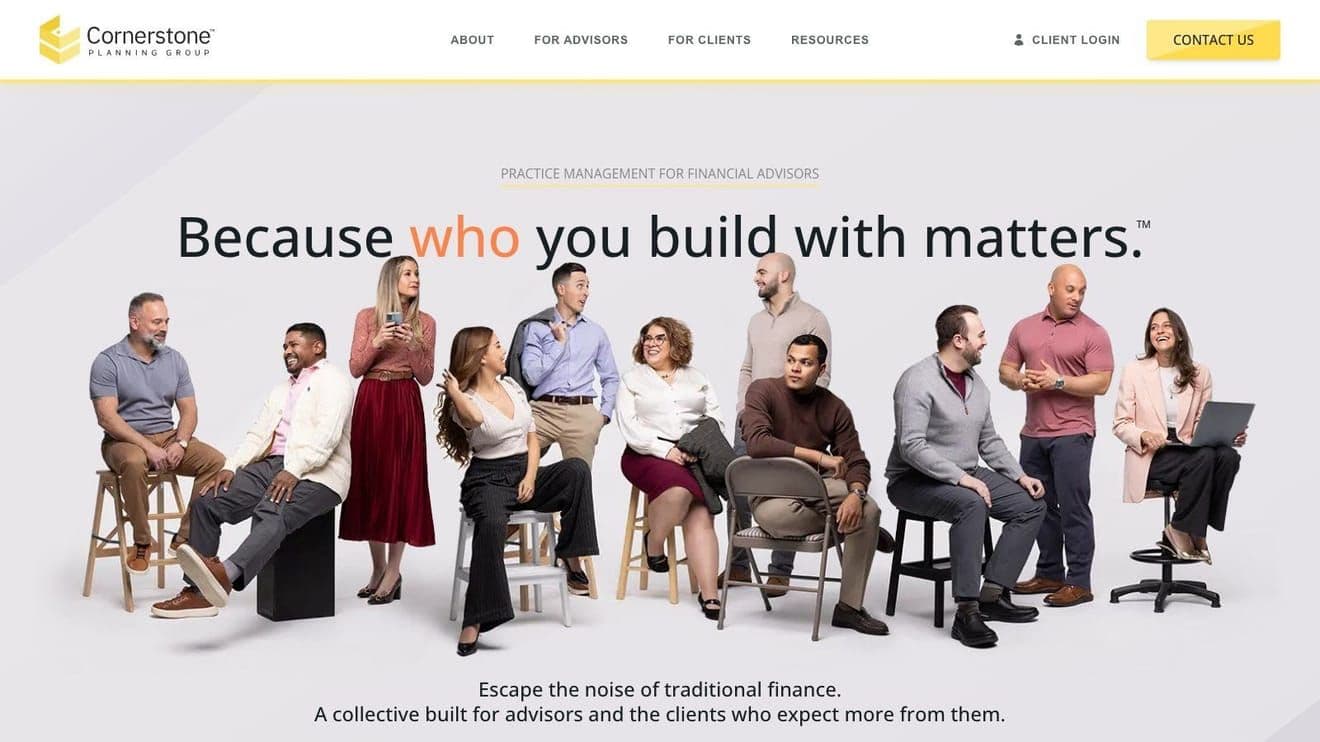
Financial advisor sites default to corporate. Cornerstone hired Uncommon Crowd for something warmer, and Uncommon Crowd hired me to make sure it still worked in year two.
Cornerstone Planning Group is a collective of independent financial advisors. They came to me through Uncommon Crowd, the branding and design studio I collaborate with. I was the sole developer. Uncommon Crowd had tried previous builds on site-builder platforms and kept running into the same wall: developers leaving, projects left half-maintained. The pitch for this rebuild was to fix that, permanently.
Before
I didn't meet the old site up close. By the time I got the project, the brief was already clear: the previous platform wasn't working, and nobody wanted to rebuild on another template. Cornerstone needed a site that was more personable, on-brand, and managed internally by a non-technical team.
Build
Uncommon Crowd handled the brand direction and the design. I handled everything else.
I'll defend killing WordPress here. Cornerstone had been using it for blog content, which meant their site lived in two places: one platform for everything, another for the blog. That split is fine on a big publication. It's painful on a small team where one person is writing a post and also trying to update an advisor bio. I moved the blog into the same Contentful instance as the rest of the site. Webinars, events, blog posts, advisor profiles, all managed in one dashboard by one person. Fewer logins, fewer "which platform was that on again" moments.
Motion was left to me. I leaned on Framer Motion for subtle transitions, the kind that make a site feel premium without anyone noticing why. A financial advisor site has to read as credible first, so I didn't want animation that called attention to itself. I wanted animation that vanishes into the experience.
Quiet Pride
The responsive layout. This site has a lot of image blocks that lock against each other, image-to-text compositions where everything has to fit together at every screen width. Getting it to hold shape from a phone to an ultrawide monitor took real work. Most people will scroll through on their phone and never realize any of it was considered. That's the part I'm quietly proud of.
Outcome
Lighthouse: 93 performance, 100 SEO.
The team updates the site themselves now. Advisors push their own changes. That was the point.
Redo
Working with an external brand team meant swapping copy, headers, and assets mid-project, sometimes for reasons like "this needs to be an H1 for SEO but shouldn't call attention to itself." If I started over tomorrow, I'd build more flexibility into the typography system up front, so every heading level has a quiet variant and a loud one and we can swap between them without touching code.